Thanks for checking us out!
We are accepting new customers for Truly Financial.


What does this mean for you?
We’re excited to offer you a better alternative to old-school banks. Truly Financial is small business banking that helps you build your company, earn more profits, and grow your global presence.
You get the ability to send or receive payments seamlessly, PLUS multi-country corporate Visa cards, local and international bank accounts, and intuitive spend management capabilities.

Free U.S. domiciled checking account (ACH & wire transfers)

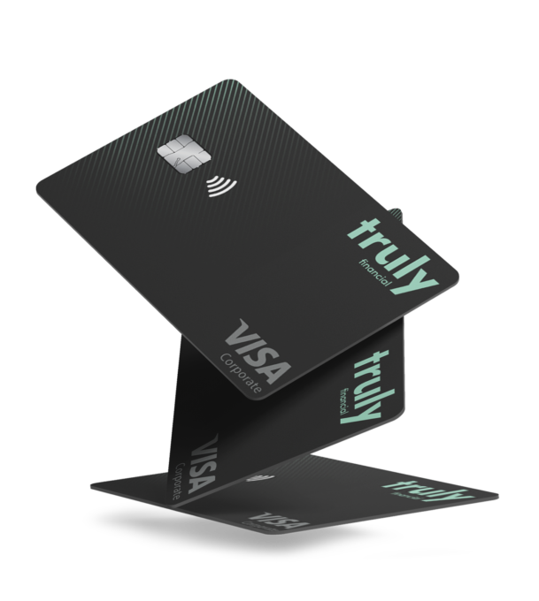
Unlimited corporate Visa cards (Up to 2.5% cashback)

Multi-currency accounts (No forced conversions)

Make payments worldwide – in local currency or in USD
FREE to signup. No contracts or monthly fees. Cancel any time.